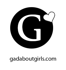
Our target audience is 18-32 which is a mix of young adult and adult women. In attempts to identify with these audiences we have chosen a strong font for the “G” for a more grown up look but have paired it with a heart to still keep in touch with our more youthful audience. It is also a representation of the both of us, we no longer feel like girls but at the same time we do not yet feel like full grown up women, we are somewhere in between. In the end, for our colors, we decided to go with a black and white logo. We felt it would keep us more identifiable with our target audience. Because with the word “girls” in our name and the colors we had before, pink and purple, people might get the wrong idea about the target age group and think we are aiming to very young girls. Black and white is classic, strong and bold. We feel all together this is the perfect fit for gadaboutgirls.com.