When we began designing the logo, we consider that the logo should also be conformable in the sense that it should be able to be displayed in black and white without altering the message. So, we created the following black and white version of the Grindia logo.

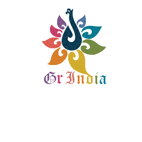
The combination of shape and color can allow you to express a message in a way that would be difficult through words alone. Furthermore, a good logo should not have to be altered on the basis of new trends each year and it should be impressive but simple at the same time. Ideally a logo needs to be something that will remain throughout the decades so that the public/customers have ample opportunity to get to know it and memorize it. Considering all of the above elements, we created the following logo for Grindia: