![]()
Logo
Final Logo
Logo Grayscale
Logo Trial 1
Logo Trial 2
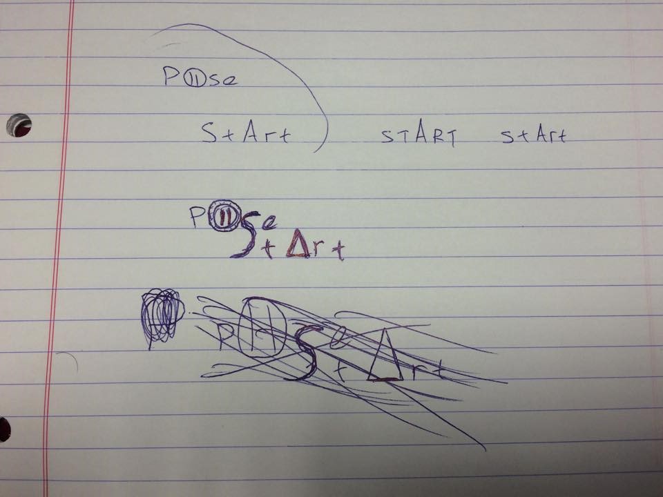
Trying to combine the words “pose” and “start”
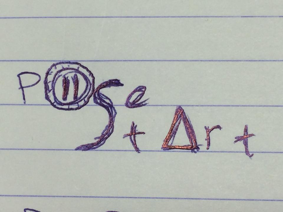
The final sketch of the logo, before designing it on Photoshop
Our logo was first approached doodling, trying to combine in a smart way the words “pose” and “start”. There is a universal code for start and pause symbols, presenting play with a filled triangle and pause with two parallel straight lines. Thus, we took advantage of these symbols and put two lines inside the letter “O” of our pose word and wrote the word start, instead of using the letter A, with a filled triangle. After that, we had to add a bit of color to our logo, so after a thorough research on the internet, we decided to use the color purple in order to paint the geometric shapes mentioned above, since purple refers to creativity, dignity, or even something magical..! Our photography exhibition should be associated with all these qualities and we hope that purple will subconsciously achieve that.